

The issue was identified during user feedback research for our Point of Sale beta program. After reviewing user session recordings, we found that over 80% of beta users disengaged after only checking with our new system once.


Our design team began expanding across all verticals. As the product design lead, I observed that we delivered diverse design solutions and tried to improve based on the original legacy design languages.
After several discussions with leadership, it's clear that we won't have the resources to build a dedicated design system team. As the product design lead, I need to consider an alternative solution. After reviewing each vertical's roadmap, speaking with individual designers, and partnering with the front-end team manager, I've adopted a "slow and small" strategy.

Initiating a design system with a navigation redesign sets a user-centric foundation, ensures interface consistency, and drives stakeholder support through immediate engagement and conversion improvements. It paves the way for a scalable, standardized design approach that enhances user experience and business outcomes, allowing for iterative development and informed decisions based on user data.

Designing a “simplified order management” project ensures tables and data displays are intuitive, efficient, and scalable, aiding quick decision-making and day-to-day operations. It sets a precedent for data-rich interfaces throughout the design system, promotes consistency and reusability, and enhances the overall user experience with clear and actionable insights. This approach streamlines order management processes and establishes a strong foundation for handling complex data across the system.

Improving the order-taking process, centered on data input elements within a design system, significantly enhances user efficiency and accuracy. This focus ensures a streamlined and user-friendly input experience and search experience, reduces errors, and sets a standard for input consistency across the design system, improving overall operational effectiveness and user satisfaction.

Both the product and engineering teams have praised our approach to the design system, recognizing its effectiveness. We understand that maintaining and expanding the design system is an ongoing effort for the design team. To address this, we adopted a bottom-up strategy to cater to our organization's multiple verticals.
The primary objective of our design system isn't strict consistency but rather accelerating innovation by allowing flexibility where needed. This means our design system is intentionally lighter compared to others, facilitating rapid adaptation and creativity. I scheduled bi-weekly reviews for us to assess the components used in various projects. During these meetings, the team collaboratively decides which components should be adopted at the vertical or company-wide level, ensuring our design system evolves effectively and inclusively.

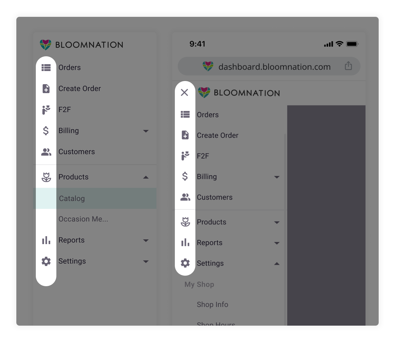
I meticulously investigated the information architecture with the engineering team during the navigation redesign project. I executed a card-sorting exercise with florists to align our design with their cognitive frameworks. Faced with technical limitations and project scope constraints, I crafted a navigation version that adeptly balanced business requirements with user needs.


I meticulously investigated the information architecture with the engineering team during the navigation redesign project. I executed a card-sorting exercise with florists to align our design with their cognitive frameworks. Faced with technical limitations and project scope constraints, I crafted a navigation version that adeptly balanced business requirements with user needs.


Thorough usability testing was conducted to validate that the final design was functional and user-friendly. We also proactively devised a plan for future iterations, intending to refine our solution based on ongoing feedback and integrate enhancements alongside other scheduled projects in our roadmap.
During UI explorations for our design system, I prioritized clarity to create an intuitive user experience. Usability testing highlighted a need for straightforward guidance within our system; users found icon-only navigation unclear.
Simplicity drove the second key aspect of our UI design strategy. Recognizing that our growing company would continue to evolve and introduce new features, we aimed for a clean, adaptable design.

By embedding clarity and simplicity into our design system's core, we laid a solid, flexible foundation for both current functionality and future enhancements. This balanced design approach facilitates ease of use while accommodating growth, embodying our commitment to a design system that evolves alongside our business and users' needs.
Launching our improved navigation resulted in a notable increase in engagement, doubling the number of active users for our Point of Sale system. The data clearly showed that the easier-to-find and accessible features encouraged florists to use the system more frequently.

I began the project with a comprehensive audit of the existing user experience, utilizing data from Google Analytics, Fullstory, community feedback from a Facebook group, and insights from our customer service team. From this, I created a 'like' and 'dislike' map for the current design, which provided clear guidance on areas for improvement and facilitated effective team communication on our objective, which is to make order management simple.

I aimed to discover the most logical and visual order for presenting information, allowing vendors to grasp their daily tasks easily.


My second strategy was through thoughtful reduction. Recognizing the differing requirements of in-shop employees and delivery drivers as our company grew, I differentiated the driver's experience by creating a 'Today's View'. This specialized view offered focused functionality, clearer calls to action, and highlighted essential information, making it particularly effective for mobile use. The feedback from florists confirmed its success; this streamlined view quickly became one of their preferred pages, offering the necessary information without the weight of an entirely new flow.

My third strategy focused on time-saving features, which create a sense of simplicity for larger shops. We aimed to streamline their operations by prioritizing quick-win features that could be implemented swiftly using industry best practices. As a result, we introduced functionality such as bulk editing, enhanced search capabilities, and advanced filtering to enable users to fulfill their needs more efficiently.


We're still on the path to completing our design system, trying various approaches to find the best way to build it and understand what makes it 'good enough'. The biggest challenge we expect to face is getting our leadership to approve the resources we need. This includes getting the right tools for documenting our work and having ongoing support from our engineers. They are key to focusing on tools like Storybook, which helps us organize our designs, and making sure our engineering team regularly uses and contributes to the design system as part of their daily tasks.